aiiStudio

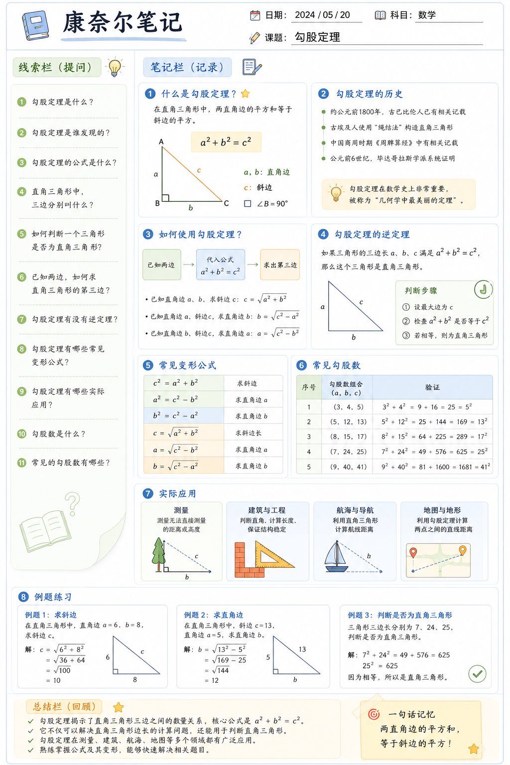


Design a high-quality infographic using a Cornell Notes layout for studying [topic]. Use an A4 vertical format, 4K resolution, flat design, a clean modern white background, and a macaron palette of blue, green, and orange. Make it suitable for printing and digital reading, with clear Chinese typography, ample whitespace, and a style similar to polished study materials, Notion, and GoodNotes.

Overall layout: the top area includes the title Cornell Notes, date, subject, and topic. The left 25 percent column is the cue/question column and contains 8 to 12 numbered questions related to the topic. The right 75 percent column is the notes/recording column and uses modular knowledge-point sections. Each knowledge point includes a subheading, concise explanation, bullet points, flowchart, arrow relationships, table, diagram, and icons. Combine text and visuals, not text only.

The bottom area is the summary/review section with 2 to 5 sentences summarizing the page. Add a one-sentence memory aid in the lower-right corner that captures the knowledge point in the easiest way to remember.

Content must focus on [topic], be accurate, clearly layered, highlight key points, support review, and feel like a high-quality textbook page. Add unified-style visual elements such as books, light bulbs, notes, flowcharts, network diagrams, module boxes, arrows, check marks, emphasis stars, and target icons. Use modular blocks, generous whitespace, rounded borders, pale section backgrounds, separate modules for each knowledge point, and clear typographic hierarchy. The final result should look like a university textbook study summary page and a professional infographic with the quality of a million-view educational course summary.