aiiStudio
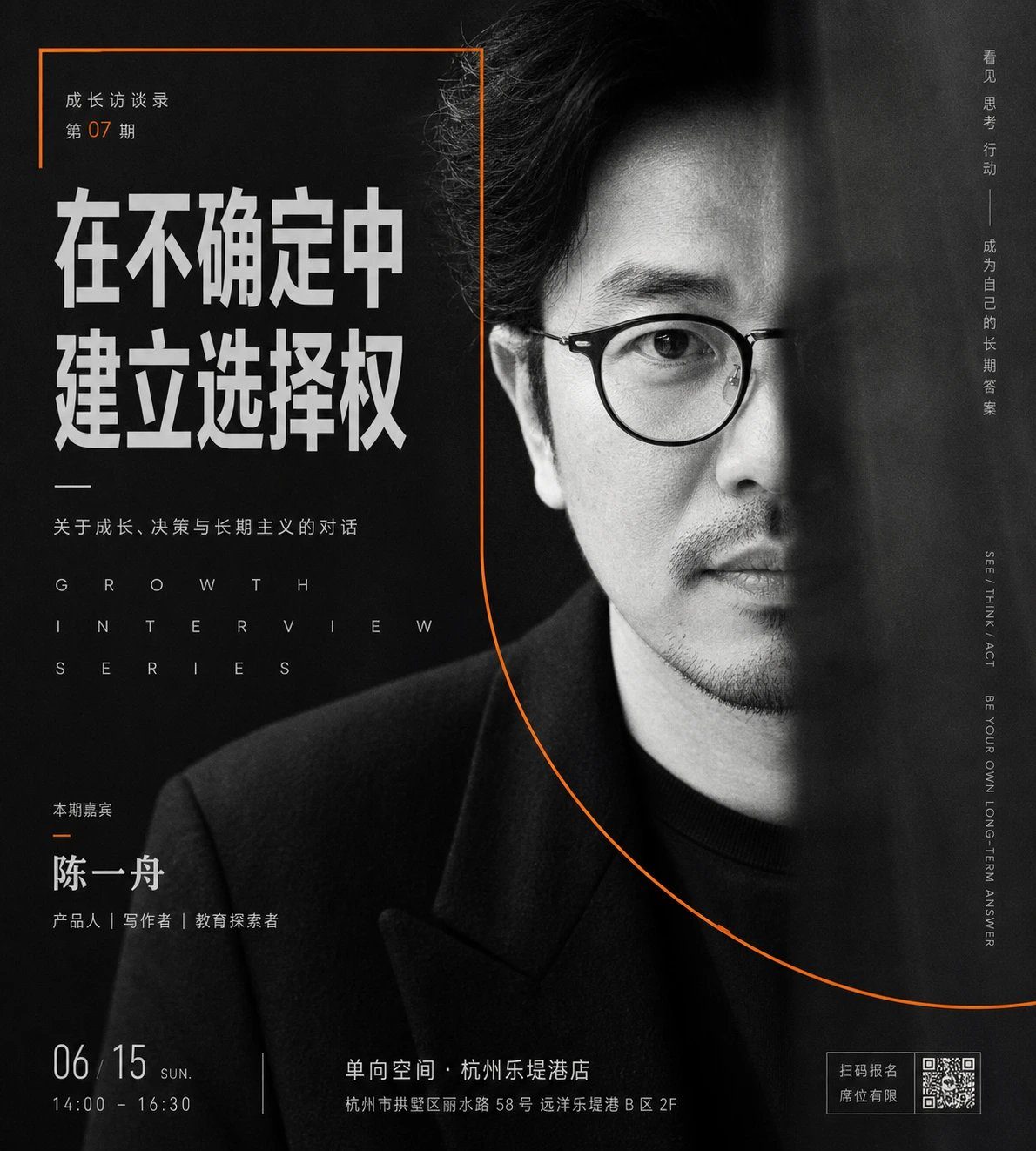

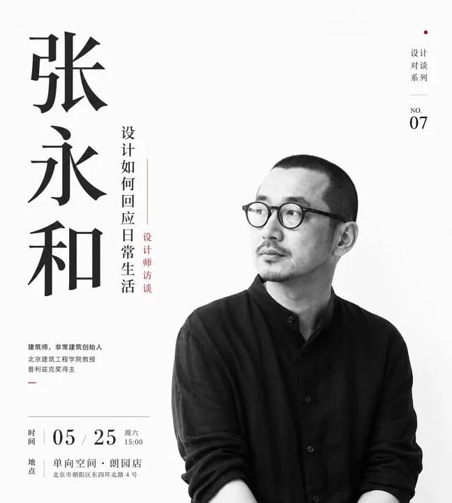
Generate a commercial growth-community portrait visual around a specific personal brand or character theme. Use a close-up human figure as the clearest visual anchor, with the person slightly turned back in a calm pose, clean contour edges, realistic facial features, and realistic clothing texture. The background should not be an ordinary scene; use a layered field with subtle fabric, paper, or wall-grain texture, and blend in a large, low-opacity portrait behind the subject so it feels like memory, public influence, or social presence. Keep only the faint face and outline in the background to create distance between the real foreground figure and the oversized backdrop image.

Make typography part of the visual structure: use a large, heavy Chinese headline at the top for the first information impact, with strong, upright letterforms and selected keywords emphasized with a metallic or warm bright color derived from the theme. Use smaller English or numeric information in the middle and lower areas to create restrained commercial order. Finish the bottom with a brand-level title and short sentence, centered layout, stable letter spacing, and clear hierarchy. Add several horizontal solid color bars as structural beams behind the person, partly hidden by the figure, to create front-back layering, rhythm, and the active feel of a community recruitment poster.

Extract the color palette from the character's industry, brand meaning, and emotional temperature. Let the large background carry a low-brightness, low-saturation, stable structural color. Use clean dark tones in the clothing and shadows to hold visual weight. Use high-brightness, low-noise information color for titles and key details. Use a small amount of high-saturation accent color derived from the theme, with limited area and precise placement. Keep the whole image calm, reliable, elite, and commercial, with clear light-dark contrast and a substantial but clean texture. Texture should add professionalism and a sense of period, without reducing the cleanliness of the face.

The final result should feel like a strong, recognizable key visual for a personal brand, growth organization, or commercial launch. At first glance, the viewer should read the character's presence and headline pressure; at second glance, they should notice the backdrop portrait, blocked color bars, texture, and precise information hierarchy.

Subject: a mature female personal brand, keeping the close-up turning-back pose and enlarged portrait wall in the background.
Use case: growth-community recruitment poster, emphasizing a trustworthy personal brand feel.
Text focus: change the title to “建立个人IP 引爆朋友圈”, while keeping the brand name, time, and cohort information.
Output size: vertical 9:16.