aiiStudio
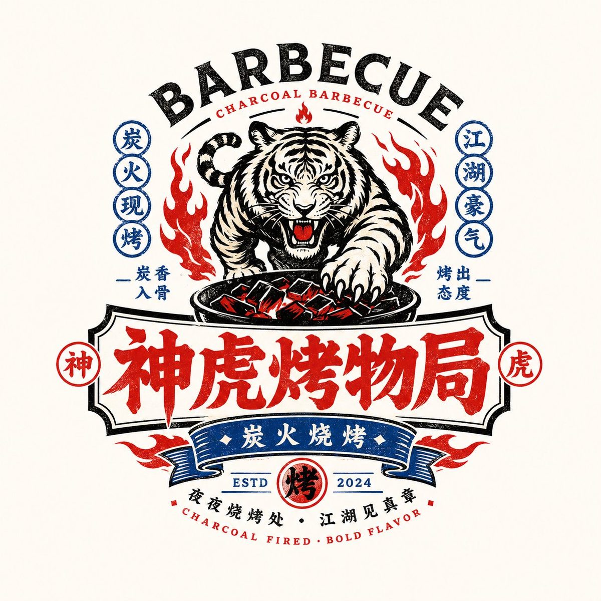
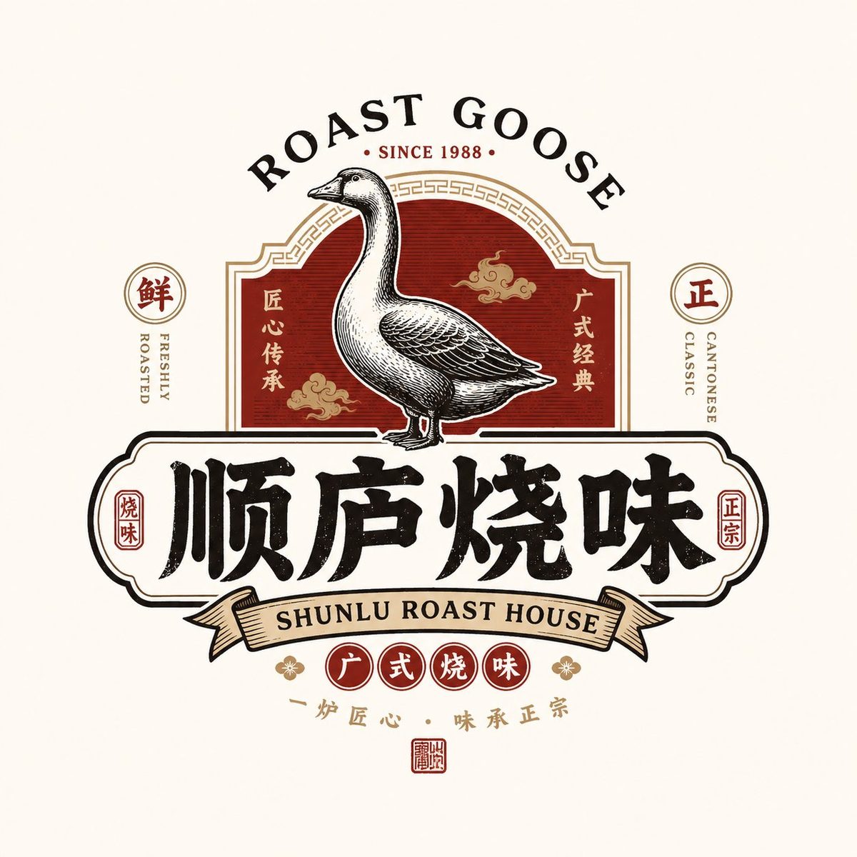
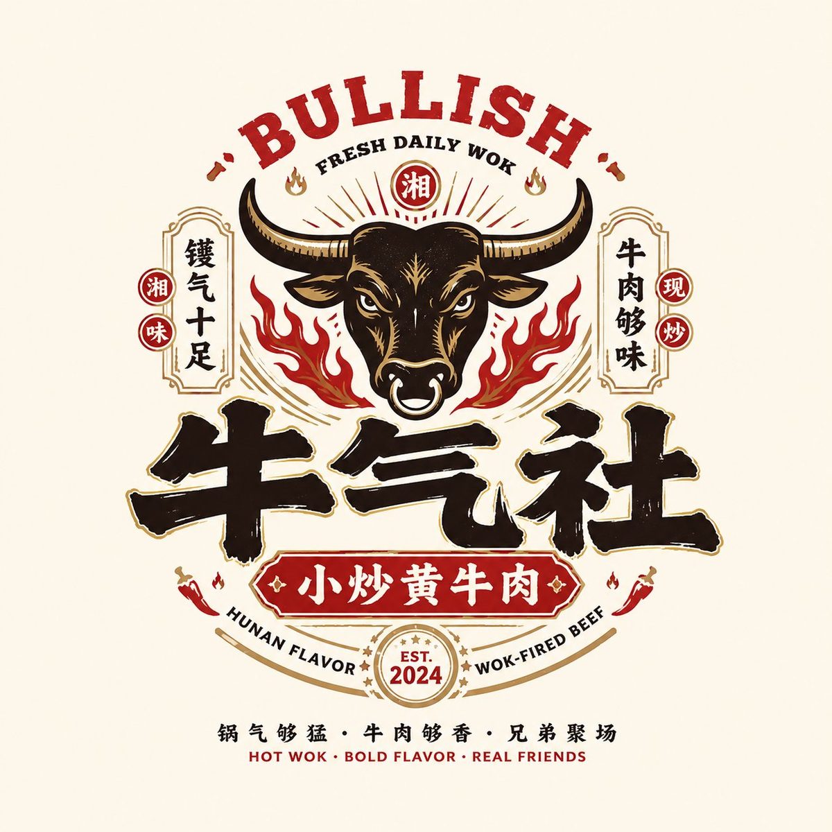

Design a high-completeness Chinese Retro Food Emblem Logo (国潮复古餐饮徽章 Logo) for a restaurant brand based on user inputs: brand name, subtitle/product name, type/industry, regional flavor (HK / Cantonese / Hunan / Sichuan / charcoal / late-night / cha chaan teng / siu mei / seafood / tavern), brand positioning, core keywords (retro, guochao, signage feel, old-establishment feel, smoky-fire vibe, jianghu spirit, new-consumption), core graphic (dragon / phoenix / crane / tiger / ox / frog / goose / fish / lobster / utensils / totem / auspicious motif), core food element, mood, primary color, secondary color, aspect ratio.

Core goal: a genuinely usable restaurant brand emblem logo — not a poster, not a cartoon. Center the design on a Chinese wordmark integrated with strong recognizable graphics, F&B category symbols, retro CN/EN typography, and a complete emblem structure. The result must read as a restaurant brand at a glance, with a clear category, mature brand identity rather than decorative pattern.

Five-layer integration: 1) Chinese wordmark = identity, 2) Graphic symbol = memorability, 3) Emblem structure = completeness, 4) CN/EN typography = hierarchy and retro brand atmosphere, 5) Color system = category mood.

Key rules: Chinese brand name must be bold, clear, signage-grade; logo must be a complete unified mark not scattered elements; graphic must relate to brand name or category; English supports Chinese, never dominates; suitable for storefront signage, menu, packaging, and social avatars; retro but not dingy; must feel like guochao retro F&B emblem (not American cartoon or Japanese shop wordmark).

Chinese wordmark: heavy, thick, signage-style retro typeface (black-style 黑体 / Song-black / commercial handwriting), clear, storefront-grade. Graphic system: pick a graphic tied to brand/category (animals/mythic creatures, ingredients/dishes, traditional totems, scene tools), retro illustration / printmaking / old trademark / guochao linework. Emblem structure: arched English top + central graphic + Chinese wordmark below; circular / oval / plaque composition. CN/EN typography: Chinese primary, English aux (HOUSE / TAVERN / BARBECUE / ROAST GOOSE / TEA RESTAURANT / LOBSTER HOUSE / ESTD / SINCE / CLASSIC / SPECIALTY).

Color systems by category: black+red (BBQ, lo mei, siu mei, tavern); black+gold (old establishments, roast goose, Cantonese); green+red+cream (HK ice room, cha chaan teng); blue+red+white (seafood, lobster, young late-night); black+blue (tavern); red+cream (Changsha noodles, traditional snacks).

Output: a high-completeness Chinese Retro Food Emblem Logo centered on the Chinese brand name, fused with retro graphic, CN/EN aux system, emblem composition and clear category attribute — a real brandable, deployable restaurant brand identity.